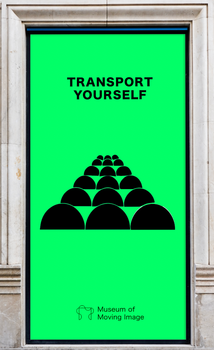
Museum of Moving Image
Brief
Create a fresh, bold, ownable voice & museum brand identity which will resonate across a multi-generational demographic (in particular 16-35 / families/ arts & film lovers) + engage the general public whilst increasing footfall and ticket sales. Provide two separate visual directions.
Objective
Optical. Stirring. Snapshot.
Contemporary with a hint of history.
Concept
The brand concept explores the unique power of moving image to evoke emotion and move us.
*conceptual project
Get Ready To Be Moved.
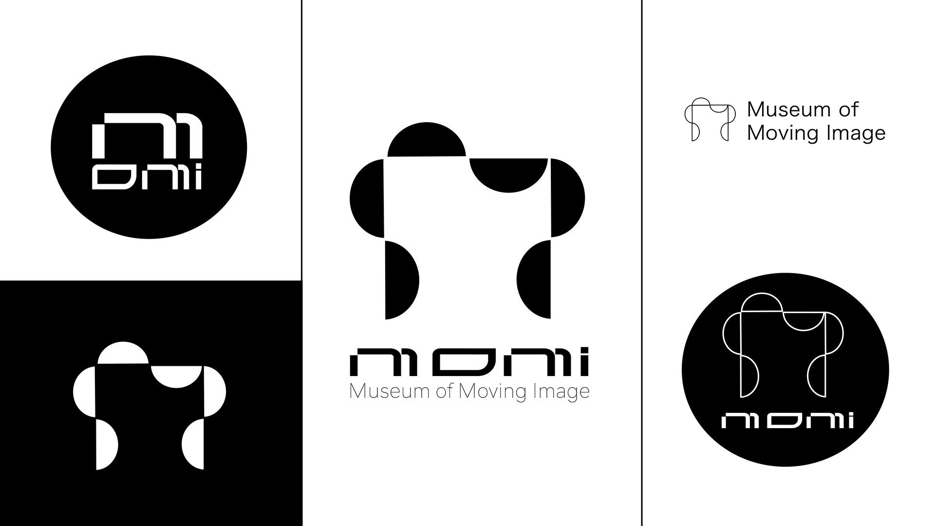
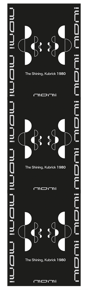
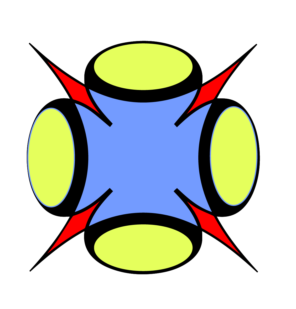
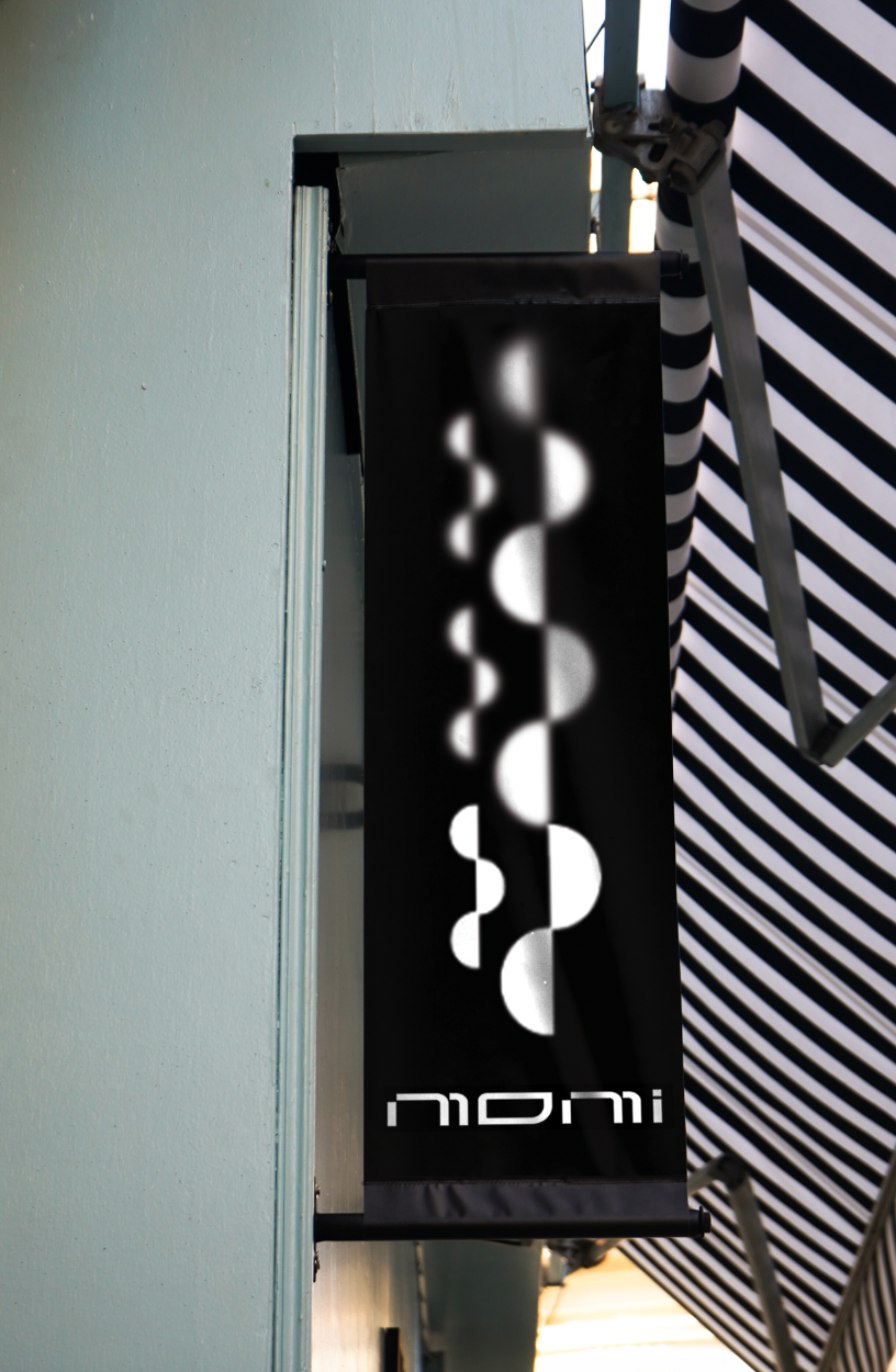
The logo's semi-circle and square lense shapes are inspired by the iconic technical pulley and lense system within the first moving image machine - the Kinetoscope (1891).
In it, a strip of film was passed rapidly between a lens and an electric light bulb while the viewer peered through a peephole.
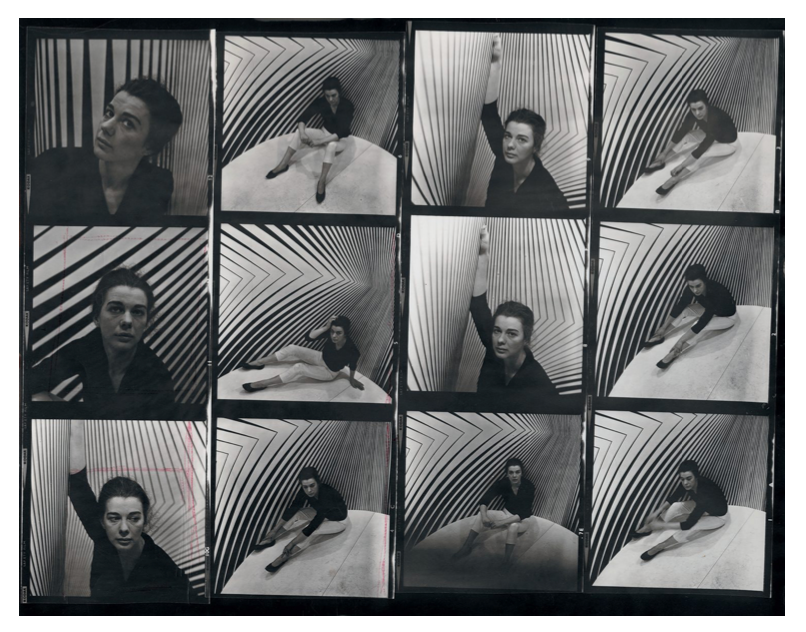
It also draws upon the visual language of Bridget Riley's Optical illusions (Op art) which can manifest as a physical sensation within the body much like a wave of emotion.
Image credits Left: Photo Ida Kahr, 1963 By Riley Bridget.
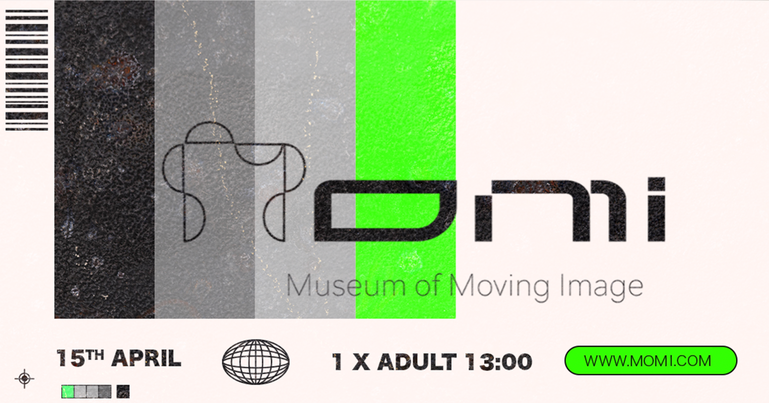
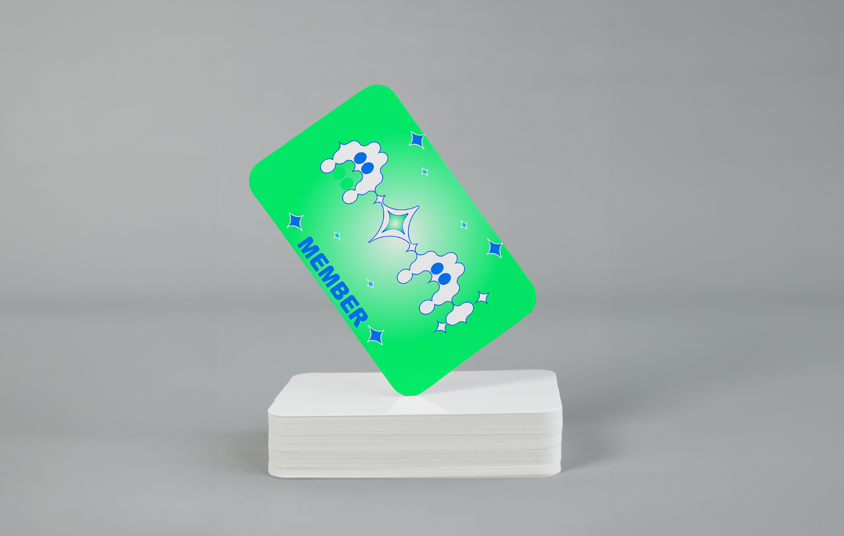
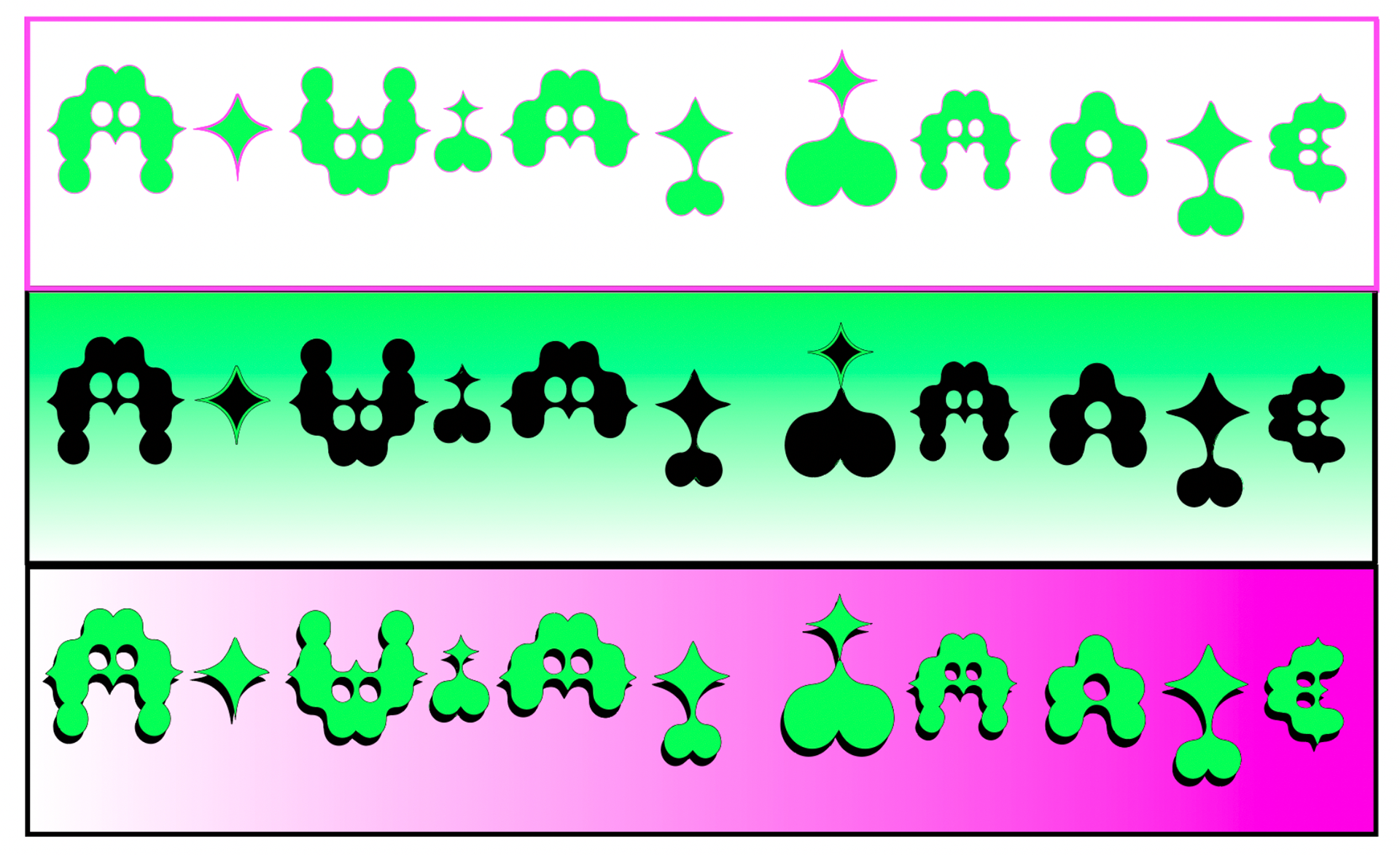
Logo Route 2 - NOSTALGIC FUTURISM
Concept Exploring the history and mystery of the silver screen from then til now
Italian Futurism (Dynamism) x Disney {iconic motion focused eras} = Disney Dynamism
Artistic. Magical. Nostalgic. Contemporary.
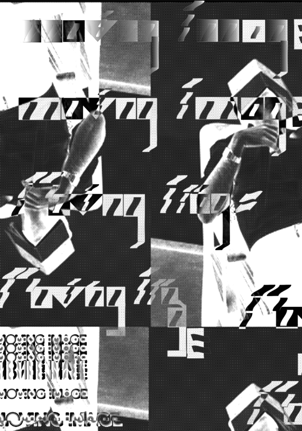
Below: black and white ideation workings inspired by early animation.
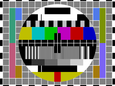
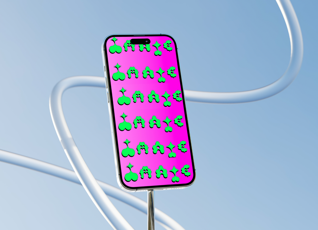
Colour research: the colour palette inspired by the iconic highly saturated (95%) colour bars historically found in TV test patterns
Recognised to many as a popular cultural symbol of the 80s and 90s and demonstrative of technological developments in moving image, it offers a balance between retro and contemporary but also fun and family friendly.
Highly saturated acid dyes were also used is in early film colourisation - each individual frame was hand painted in block colour (a process borrowed from lantern slides).